The Influence of Colors on the Organization of Minimalist Spaces
Understanding the Power of Color in Minimalist Design
Color shapes our perception of space, influencing both mood and functionality. In minimalist design, where simplicity is key, the choice of hues can make or break the atmosphere. Exploring this relationship can enhance our understanding of how to organize spaces effectively and create environments that resonate with users. A well-chosen color palette not only highlights minimalist elements but also enriches the overall experience of the space.
The Emotional Response to Colors
Different colors evoke distinct feelings, and in minimalist spaces, this can lead to significant transformations in how occupants perceive their environment. For instance:
- Blue: Frequently associated with serenity and peace, blue can promote calm and relaxation; it’s an ideal choice for bedrooms or meditation rooms. For example, a soft powder blue can create an atmosphere that encourages restful sleep.
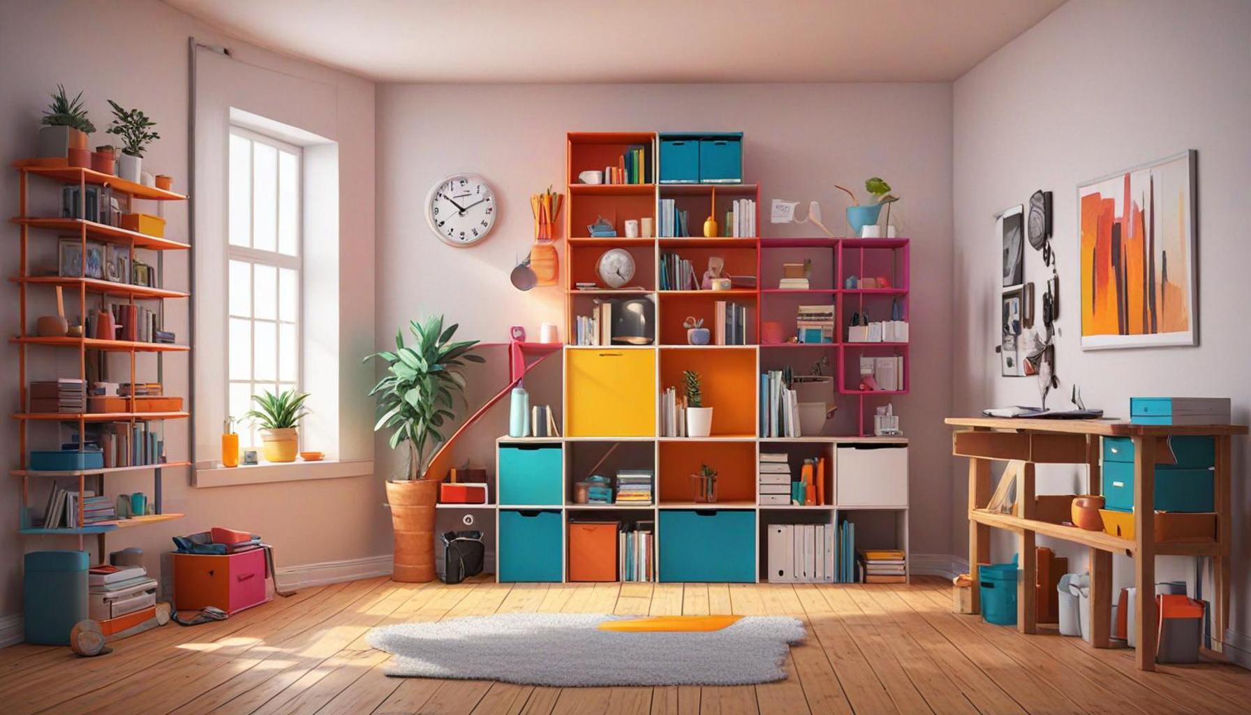
- Yellow: A bright and cheerful hue, yellow stimulates happiness and creativity, making it suitable for areas where people gather to brainstorm or socialize. A sunflower yellow accent chair in a minimalist living room can add a splash of energy without overwhelming the space.
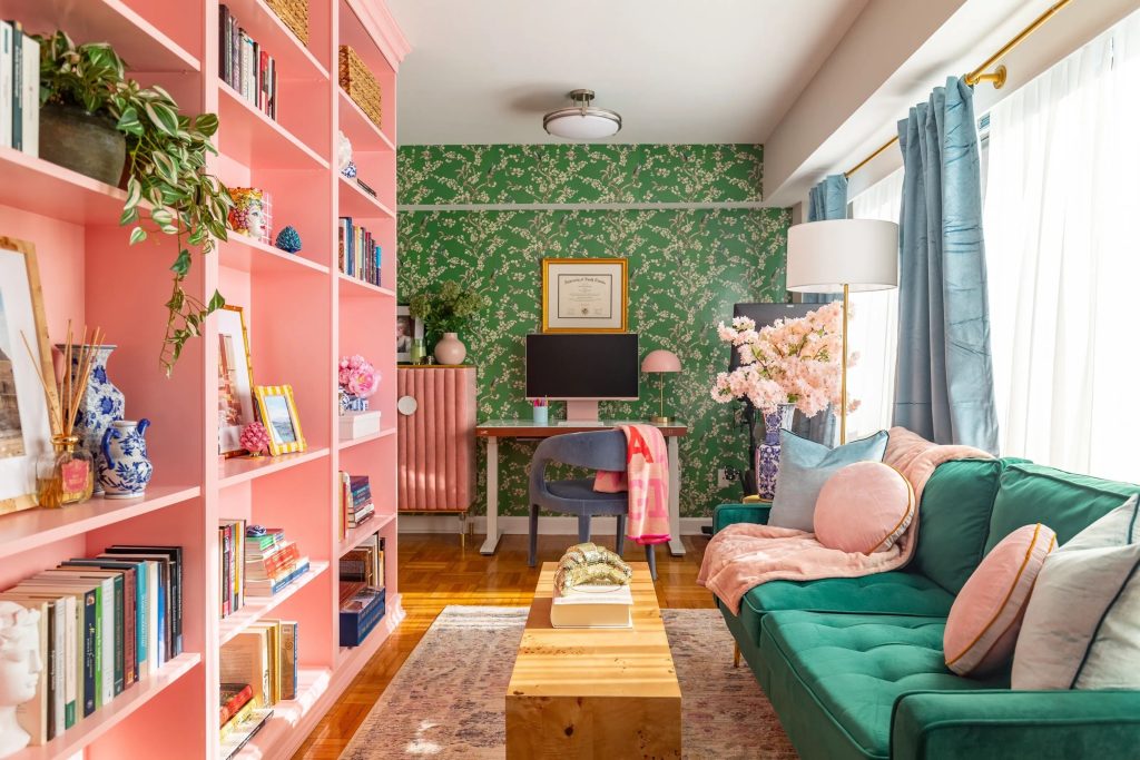
- Green: Often linked to nature, green offers a sense of balance and renewal. Incorporating shades of green, like sage or mint, can create a fresh and invigorating environment, perfect for home offices or study areas.
These emotional responses are crucial as they guide how occupants interact with their environment. In minimalist spaces, the ability to create tranquility and reduce clutter is paramount, making the right color palette essential for enhancing moods and fostering productivity.
Practical Applications in Design
Incorporating color in minimalist design goes beyond mere aesthetics; it involves thoughtful, strategic planning. Here are several practical applications that illustrate how to utilize color effectively within minimalist frameworks:
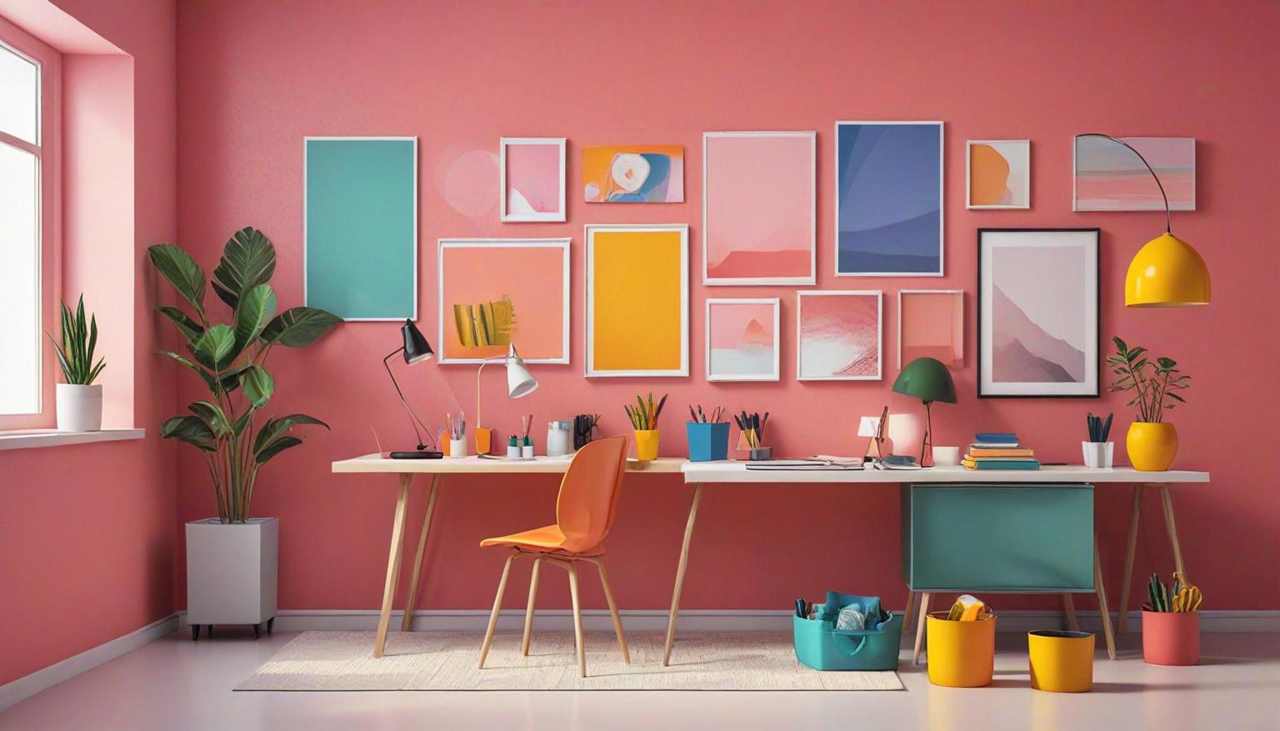
- Accent Walls: A bold color can enhance the aesthetic by serving as a focal point. For example, a deep navy blue accent wall can ground a light-colored room while creating depth and interest.
- Textiles: Soft furnishings, such as cushions or throws in muted tones, can subtly introduce warmth without overwhelming the space. A few well-placed pastel throw pillows can brighten up a minimalist beige sofa, adding comfort and style.
- Natural Elements: Integrating plant life and greenery not only enhances the color dynamics but also promotes a sense of well-being. A few strategically placed potted ferns or snake plants can enliven a space and connect the indoor environment with nature.
Each of these elements interacts to inform the overall organization of the space, creating a harmonious balance between color, function, and minimalist aesthetics. Understanding this influence is imperative for anyone looking to optimize minimalist environments for comfort and clarity. Armed with the knowledge of color psychology and practical applications, designers can create spaces that resonate on multiple levels, evoking tranquility and fostering a sense of well-being in everyday life.
DISCOVER MORE: Click here to deepen your understanding
Exploring Color Theory in Minimalist Environments
To fully grasp the influence of colors on minimalist spaces, it is essential to delve into color theory and how it applies to spatial design. Colors are not merely decorative elements; they are powerful tools that can alter perceptions, evoke emotions, and affect human behavior. In minimalist design, where the philosophy prioritizes simplicity and functionality, the strategic use of color can enhance the spatial experience significantly.
Minimalist spaces often rely on a neutral palette, with whites, blacks, and grays dominating the scene. However, understanding how to intersperse color can transform these austere environments into vibrant yet calming spaces. The key lies in identifying how various colors affect mood and interaction, leading to intentional choices in decor and organization.
Color Temperature and Its Impact
One crucial aspect of color to consider in minimalist design is color temperature. Colors can be classified as warm, cool, or neutral, each evoking different emotional responses and influences on spatial perception:
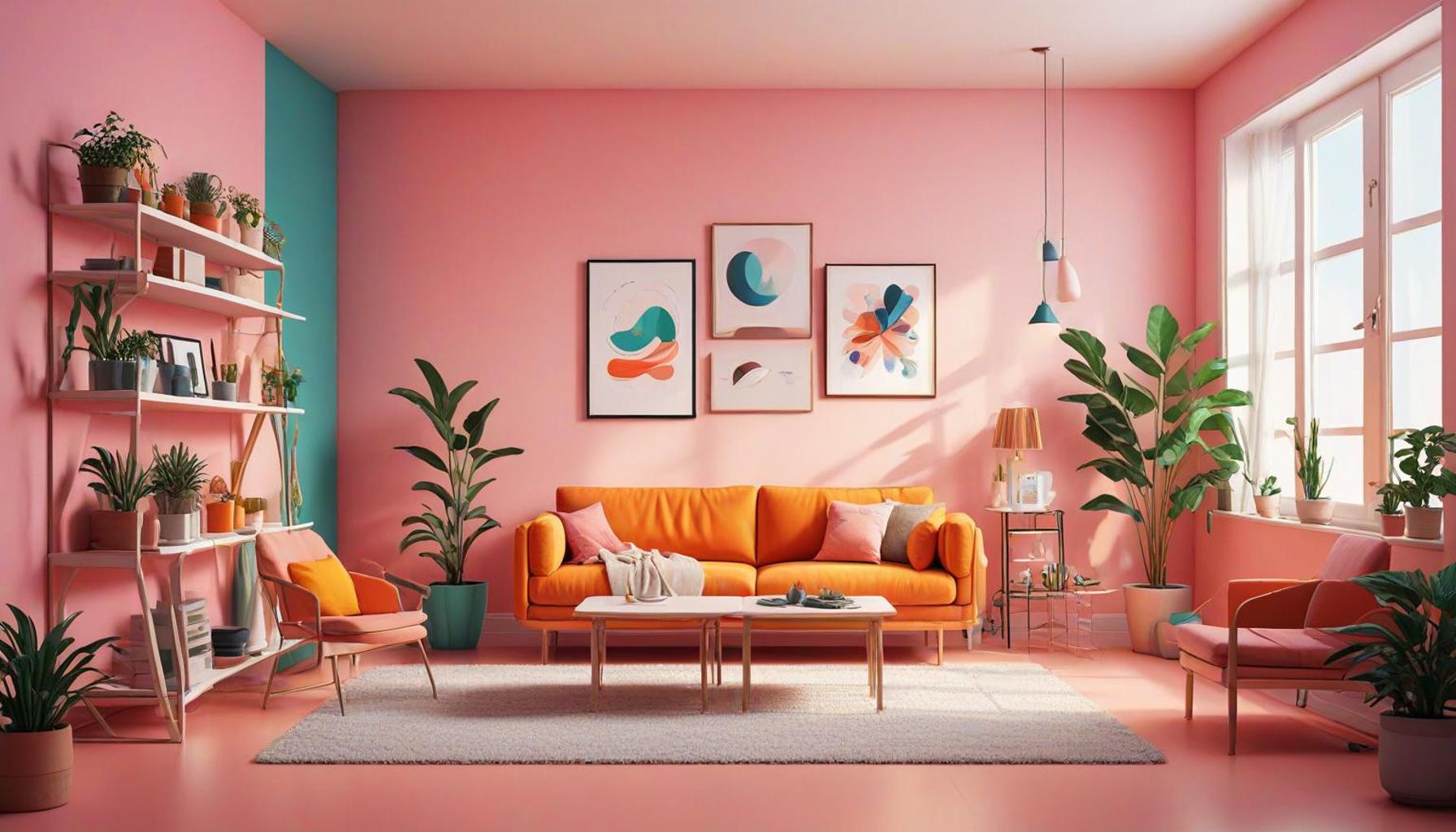
- Warm Colors: Shades of red, orange, and yellow create warmth and a sense of excitement. They can make spaces feel more inviting. A touch of warm color, like a burnt orange rug, can add a cozy element to an otherwise stark living room.
- Cool Colors: Blues, greens, and purples foster calmness and tranquility. They can visually expand a space, making it feel larger. For instance, a pale seafoam green can provide a refreshing backdrop for a minimalist workspace, allowing for concentration and creativity.
- Neutral Colors: Whites, grays, and beiges create a versatile canvas that can highlight architectural features and minimalist furniture. A soft white kitchen with minimalist cabinetry can feel expansive and clean, yet personalized with colorful kitchenware or art.
Recognizing the temperature of colors aids designers and homeowners in crafting serene environments that align with their intended use of space. For example, while warm colors invigorate social areas, cool hues can enhance the experience of relaxation in private spaces.
Complementary Colors and Visual Interest
Incorporating complementary colors—hues opposite each other on the color wheel—can introduce balance and visual interest to minimalist settings. This technique can be particularly effective in creating focal points or accentuating specific areas:
- Strategic Color Pairing: For instance, pairing a muted blue with a vibrant orange can generate energy in a neutral living room without overwhelming the senses. Choosing the right intensity can ensure harmony.
- Layering Textures: Using various materials alongside complementary colors—like a brick-red wall adorned with light wooden shelves—adds depth while maintaining a minimalist approach.
Through thoughtful consideration of color, designers and residents can tune the atmosphere to align with the intended purpose of each space. Ultimately, understanding these nuances of color in minimalist design deepens our appreciation of how organized and intentional use of colors can create harmonious environments that prioritize both beauty and function.
| Color Psychology | Impact on Minimalist Design |
|---|---|
| Warm Colors (Red, Orange, Yellow) | These colors evoke energy and enthusiasm, ideal for social spaces like living rooms. |
| Cool Colors (Blue, Green, Purple) | These shades promote calmness and focus, making them perfect for home offices or reading nooks. |
| Neutrals (White, Gray, Beige) | Neutrals serve as a backdrop, enhancing the spaciousness and simplicity characteristic of minimalism. |
| Accent Colors | Using a splash of vibrant color can create visual interest and enhance the overall aesthetic. |
Minimalist spaces thrive on the principle of “less is more.” By carefully selecting color palettes, one can significantly influence the mood and functionality of these environments. For instance, incorporating warm colors in communal areas can spark creativity and conversation, while cool colors in workspaces encourage concentration and tranquility. Neutrals are vital as they balance out more vibrant hues, ensuring a seamless blend that adheres to minimalist aesthetics.Exploring the psychological effects of colors not only enriches the design process but also enhances the living experience. Homeowners are encouraged to consider how different colors can tailor their spaces to reflect personal tastes while optimizing for practicality. The dynamic interplay between color and minimalist design opens up new avenues for creating harmonious and inviting atmospheres.
DISCOVER MORE: Click here to learn about intentional design
Psychological Effects of Color in Minimalist Design
Diving deeper into the realm of colors, it’s crucial to acknowledge their psychological effects—a dimension that is particularly pivotal in minimalist spaces. The bare essence of minimalist design often provokes unique interactions with the human psyche and the environment. Colors play a profound role in this interaction, influencing both mood and behavior. For instance, research has shown that distinct colors can elicit physical and emotional reactions, heightening awareness of how they should be employed within minimalist environments.
The Role of Color in Productivity and Focus
When it comes to workspaces designed with minimalism in mind, color can significantly impact productivity and focus. Studies have indicated that certain shades can enhance cognitive function and facilitate a productive atmosphere. For example:
- Cool Blues: Known to stimulate clarity and communication, blue hues in an office setting can create an organized and open environment. This color has been shown to lower stress levels, promoting concentration, which is crucial for tasks requiring intense focus.
- Vibrant Yellows: When introducing a burst of yellow in moderation, such as through an artwork or an accent chair, it can inspire creativity and invigorate the space. The challenge lies in balancing its intensity; excessive exposure might lead to agitation.
- Earthy Greens: Signifying balance and tranquility, green is particularly effective in spaces where relaxation is paramount. Incorporating plants in soft green tones can enhance air quality while maintaining a serene setting for unwinding or brainstorming.
These findings indicate that while a minimalist design often emphasizes fewer colors, the strategic application of specific shades can be pivotal in enhancing user experience within the space.
The Cultural Dimension of Color in Minimalist Spaces
Additionally, understanding that color perception is often shaped by cultural backgrounds can add a richer layer to minimalist design decisions. What may evoke calmness in one culture might inspire energy in another. For example:
- Red Colors: In many Asian cultures, red symbolizes luck and celebration, making it an excellent choice for communal spaces where vibrancy is desired. A minimalist dining area can come alive with a simple red accent wall, ensuring a warm ambiance for gatherings.
- Black and White Contrast: In Western design contexts, using black and white maintains a classic elegance. However, it can carry different implications based on the cultural narrative surrounding these colors. In minimalist spaces, adding textures or materials can soften this stark contrast while still embracing the overall theme.
Incorporating culturally relevant colors creates a sense of place and belonging, allowing spaces to resonate more with their inhabitants.
The Impact of Natural Light on Perceived Colors
Another vital element that influences the effectiveness of color in minimalist interiors is the relationship between color and natural light. The amount and quality of light in a space can shift the way colors are perceived:
- Sunlit Spaces: Colors can appear more vibrant and lively in naturally lit areas. Therefore, a minimalist living room bathed in sunlight can brilliantly accentuate warm tones without overwhelming the senses.
- Artificial Lighting: Understanding light temperature—from warm to cool—can also impact color perception. Pendant lights with warm bulbs can enhance the coziness of neutral palettes, while cooler fluorescent lights may diminish the vibrancy of integrated colors.
Ultimately, the dance of color, light, and minimal design extends beyond mere aesthetics. It can deeply affect how we feel, work, and connect within our environments. By taking into account psychological, cultural, and environmental facets of color usage, individuals can achieve a profound sense of harmony and purpose in their minimalist spaces.
DISCOVER MORE: Click here to learn how to create minimalist spaces at home
Conclusion
In exploring the influence of colors on the organization of minimalist spaces, it’s clear that color is not merely an aesthetic choice—it’s an integral component that shapes our experiences and interactions within these environments. By understanding the psychological effects of different hues, we can strategically design spaces that enhance well-being, productivity, and creativity. The selected colors can evoke specific emotions, whether it’s the calming effect of greens or the invigorating charm of yellows, highlighting that a minimalist design can be both simple and profoundly impactful.
Moreover, recognizing the cultural dimensions of color deepens our approach to design. It allows us to create spaces that resonate with diverse backgrounds and experiences, fostering a sense of community and belonging. As we consider how different cultures interpret colors, we’re reminded of the importance of inclusivity in our design decisions.
Finally, the interplay between natural light and color encourages us to be attentive to our environment. Lighting conditions significantly influence how colors are perceived, which underscores the necessity of harmonizing both elements in minimalist spaces. By embracing these insights, we can cultivate environments that are not only visually appealing but also emotionally enriching.
As you contemplate your own minimalist spaces, consider how a thoughtful palette can transform not just the visual appearance, but also the atmosphere and functionality of the area. With the right approach, colors can indeed be the invisible thread that ties minimalism to a meaningful human experience.